Open House for Science
"Translating science into clear, public-friendly visuals."
The Faculty needed to make research and programmes understandable for audiences beyond academia, who often have limited attention spans, and translate content that was frequently too technical for public channels.
Responsible for helping the public understand research and academic programmes by turning complex inputs into accurate and engaging content. Work ranged from day-to-day publicity to revamping the Open House booth concept to enhance visitor experience.
Client
National University of Singapore, Faculty of Science
Scope
Information Visualisation
Event Activation
Digital Marketing
Web Design
Date
2025 - 2026
Design Process
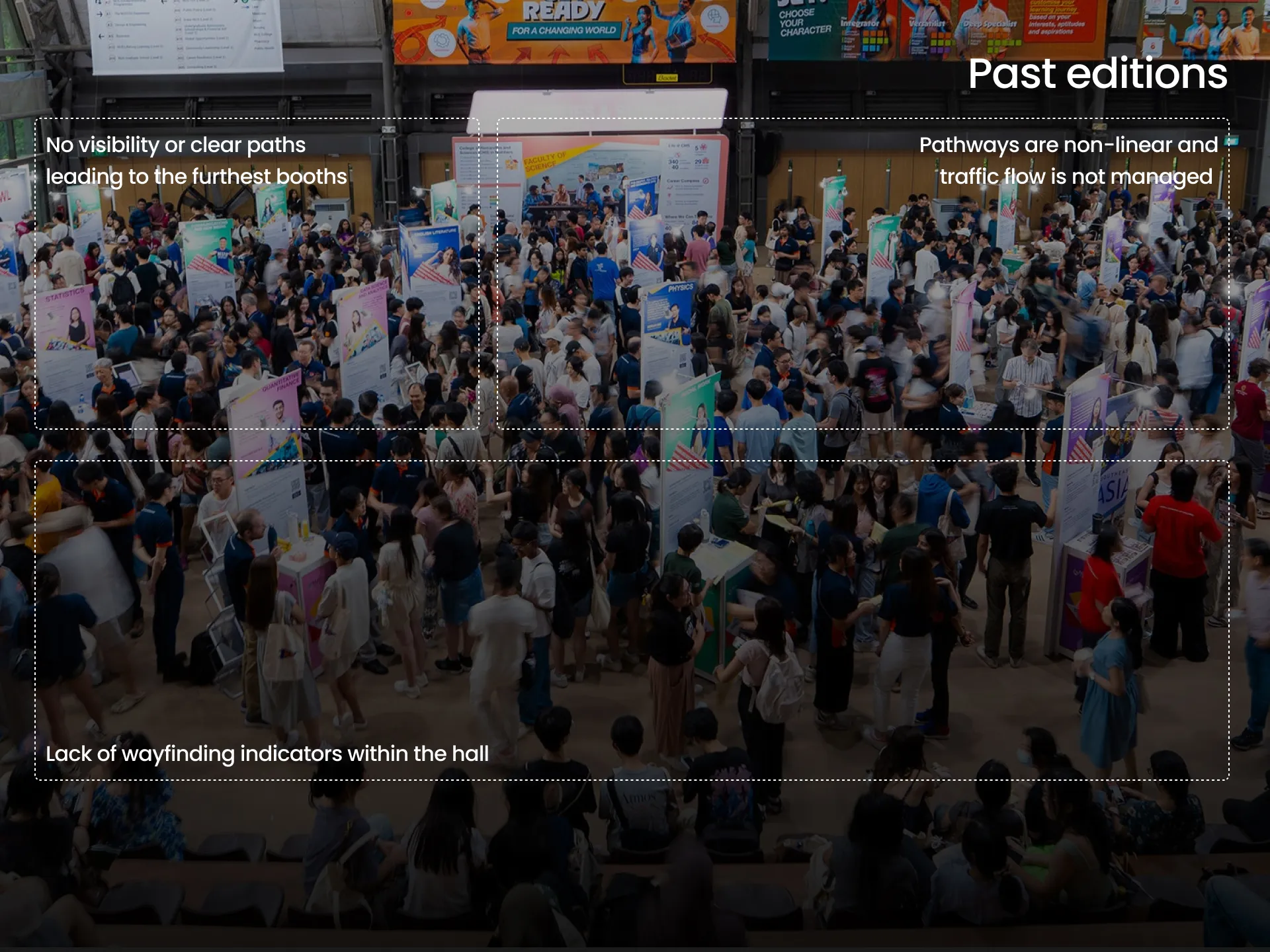
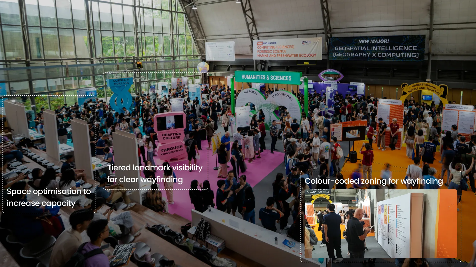
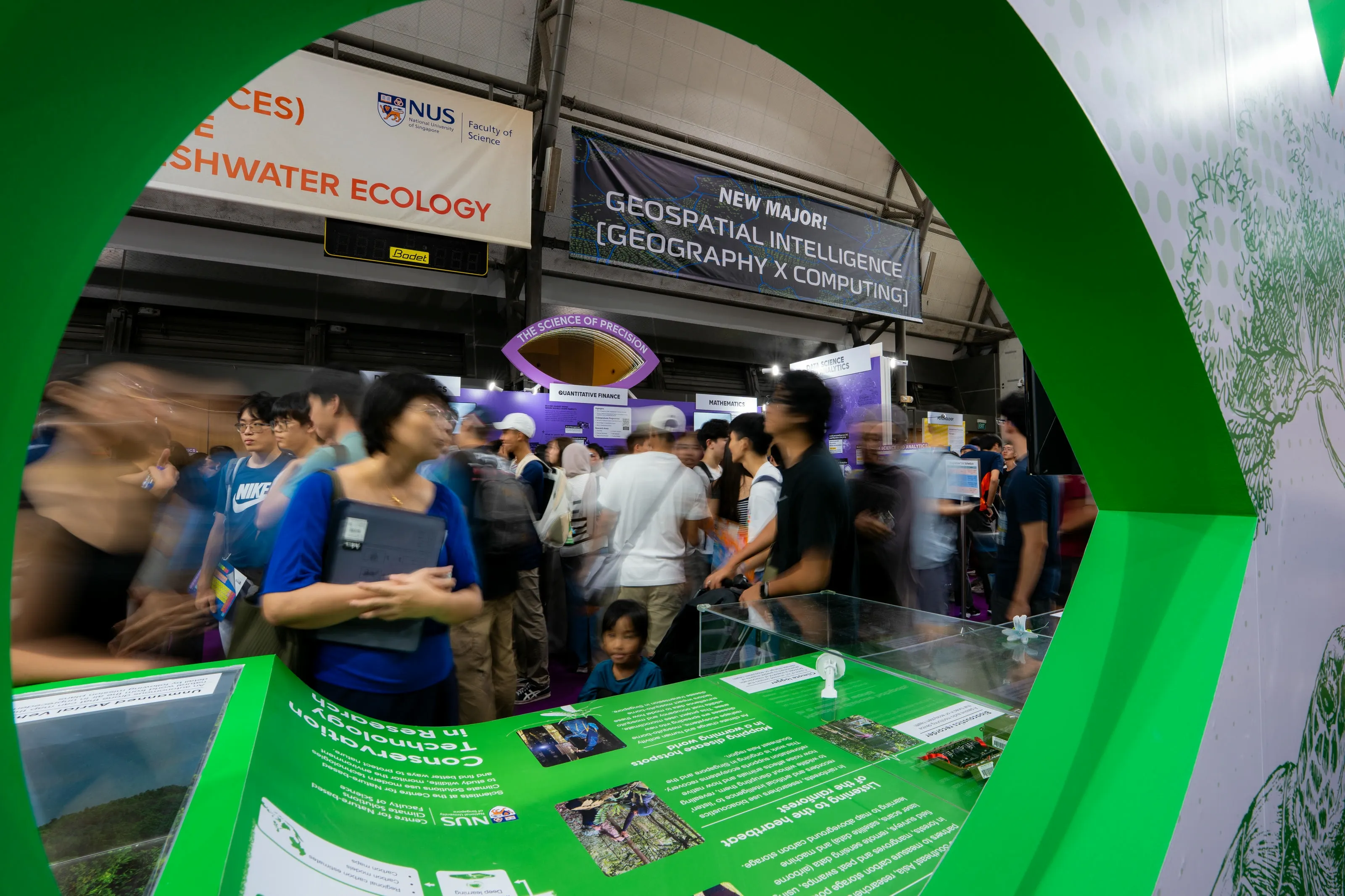
Crowding and poor navigation between booths disrupted the event experience in past editions, causing bottlenecks and confusion. The revamp focused on improving crowd flow and wayfinding, so that programme information remained clear even during peak periods.
Essential features we needed
- Themed zoning to help visitors find programmes faster and manage crowd density
- Tall, visible landmarks to support wayfinding in heavy crowds
- Distinct booth content so that information is easier to scan and remember
- Smarter space planning to reduce bottlenecks and increase capacity
Past Year Layout
Visitor journey mapping
We mapped the visitor journey to uncover potential touchpoints.
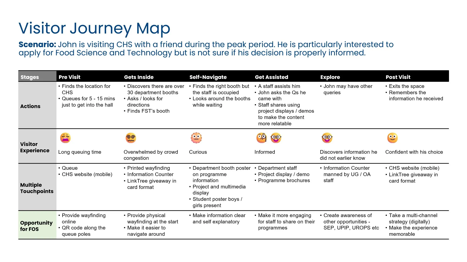
User Journey mapping
Predictive crowd heatmapping
Studied crowd density, as traditional grid layouts and their non-linear flow can cause crowd clusters to mix and disrupt traffic.
Hover over the images to view the heatmaps.
Past Year Grid layout
The grid arrangement reduce visibility of booths at the far ends.
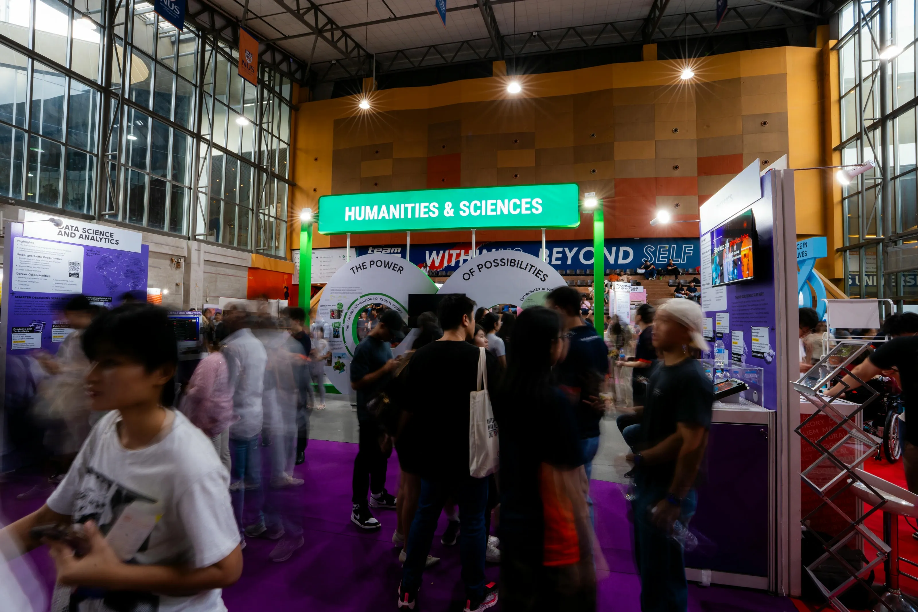
Proposed Zoning
Zoning with intent to traffic flow visitors into 5 crowd clusters, allowing clear path towards any of the zones.
.webp)
Outcome
Event experience solutions
Event fabrication
Translated concepts into build-ready designs so the information is relayed with precision
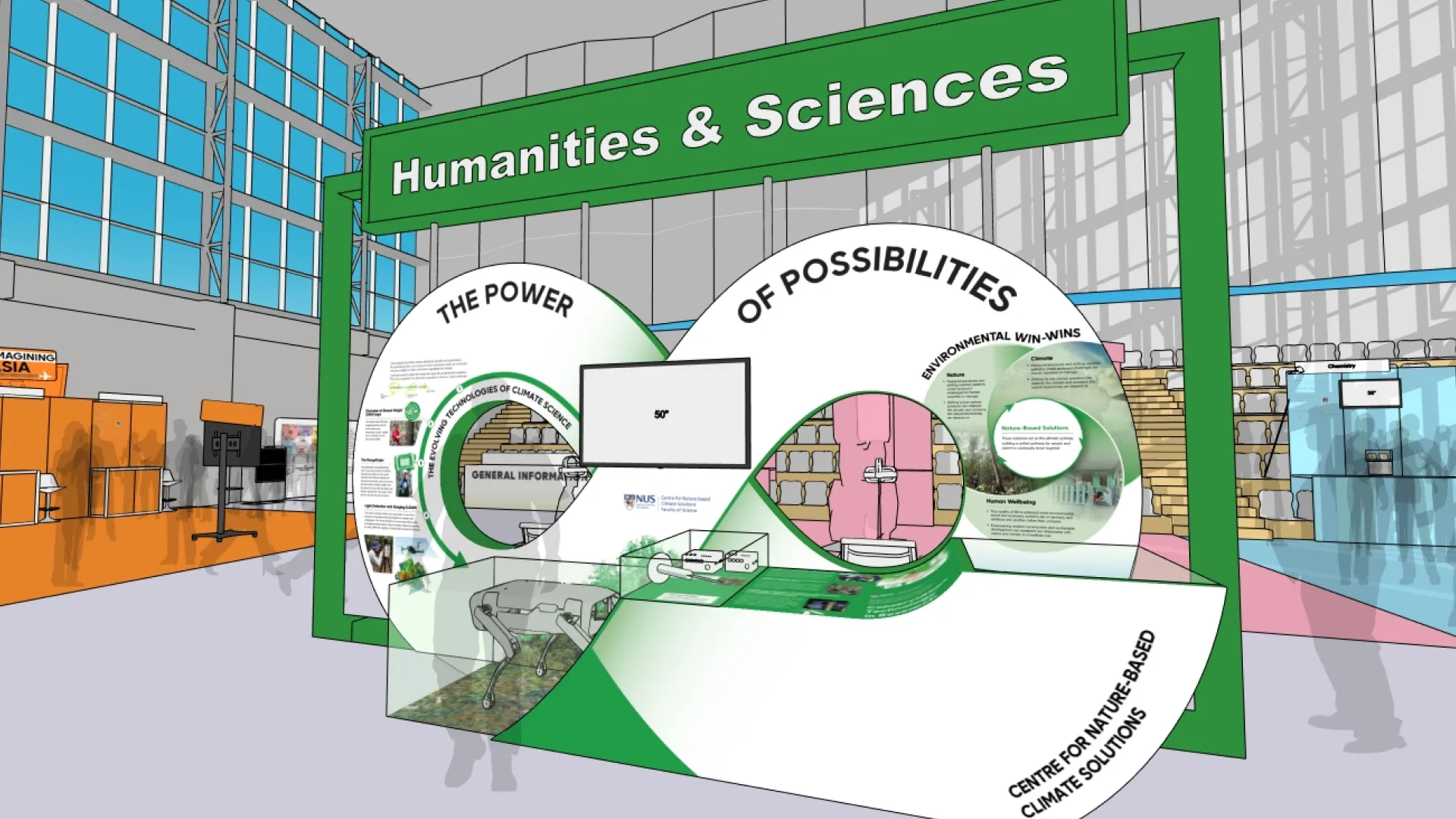
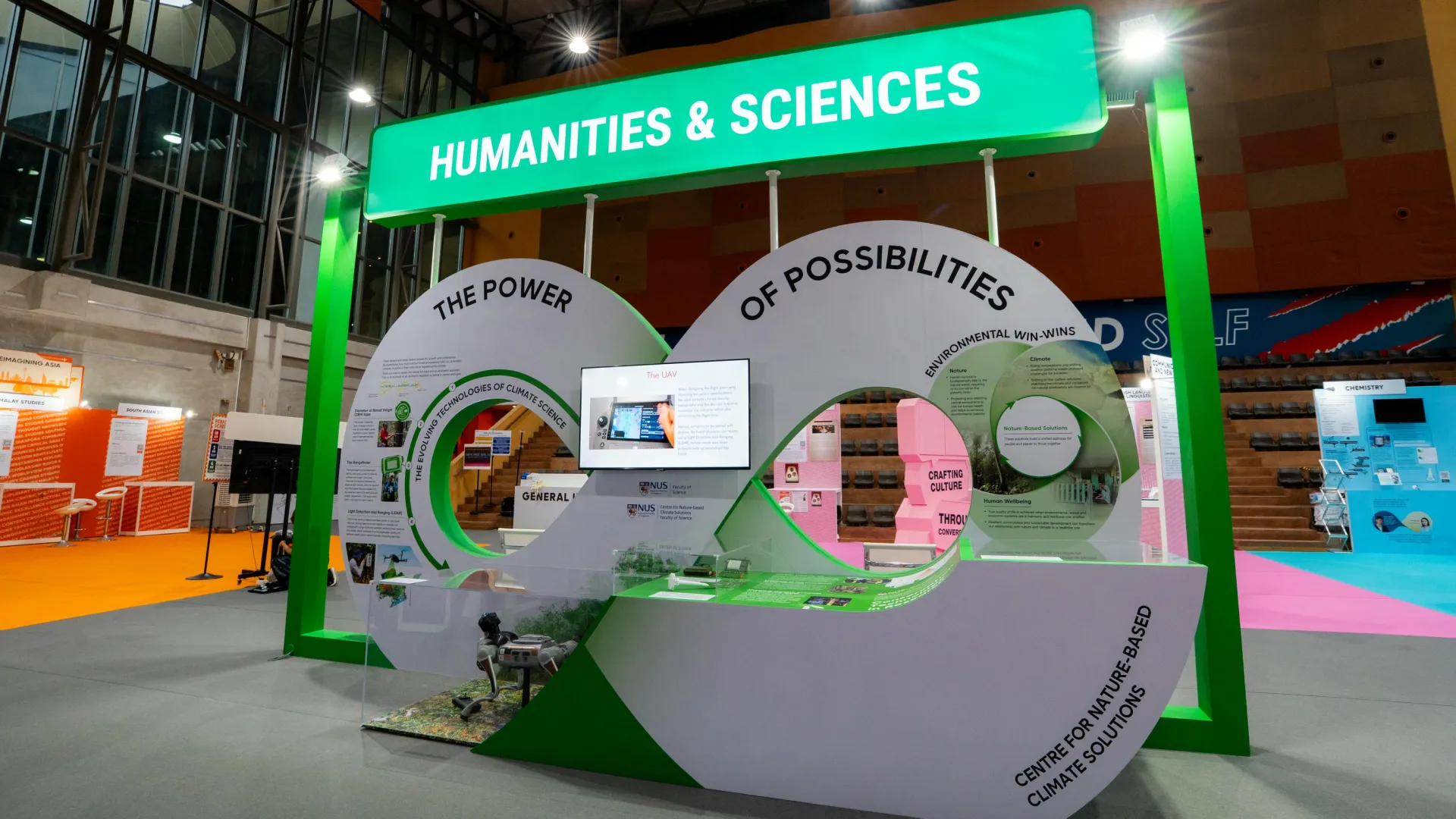
From concept to Fabrication
Zonal wayfinding landmarks
Tall, visible markers with tiered heights so visitors can orient quickly in dense crowds, reducing confusion.
.webp)
helix landmark
.webp)
infinite LED landmark
infinity sign showcase
.webp)
conversations landmark
Data-to-visual translation
Turned dense scientific content into visuals that help non-specialists grasp the key idea quickly, without losing accuracy.
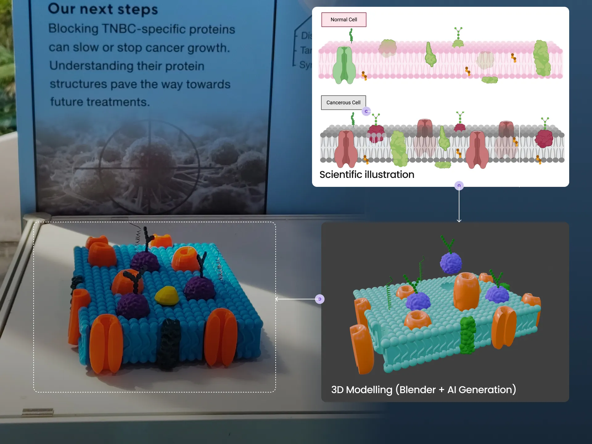
translating science to 3D prints
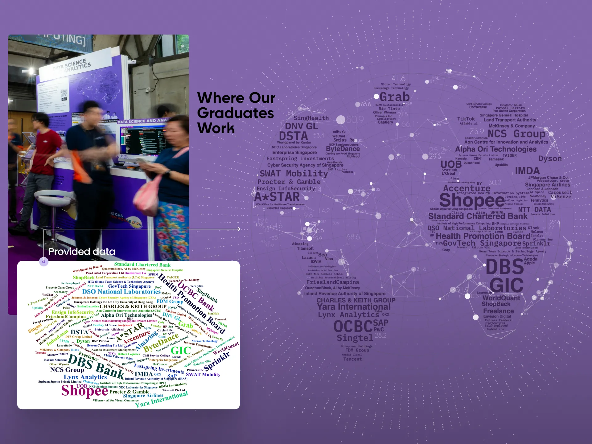
word cloud visualisation
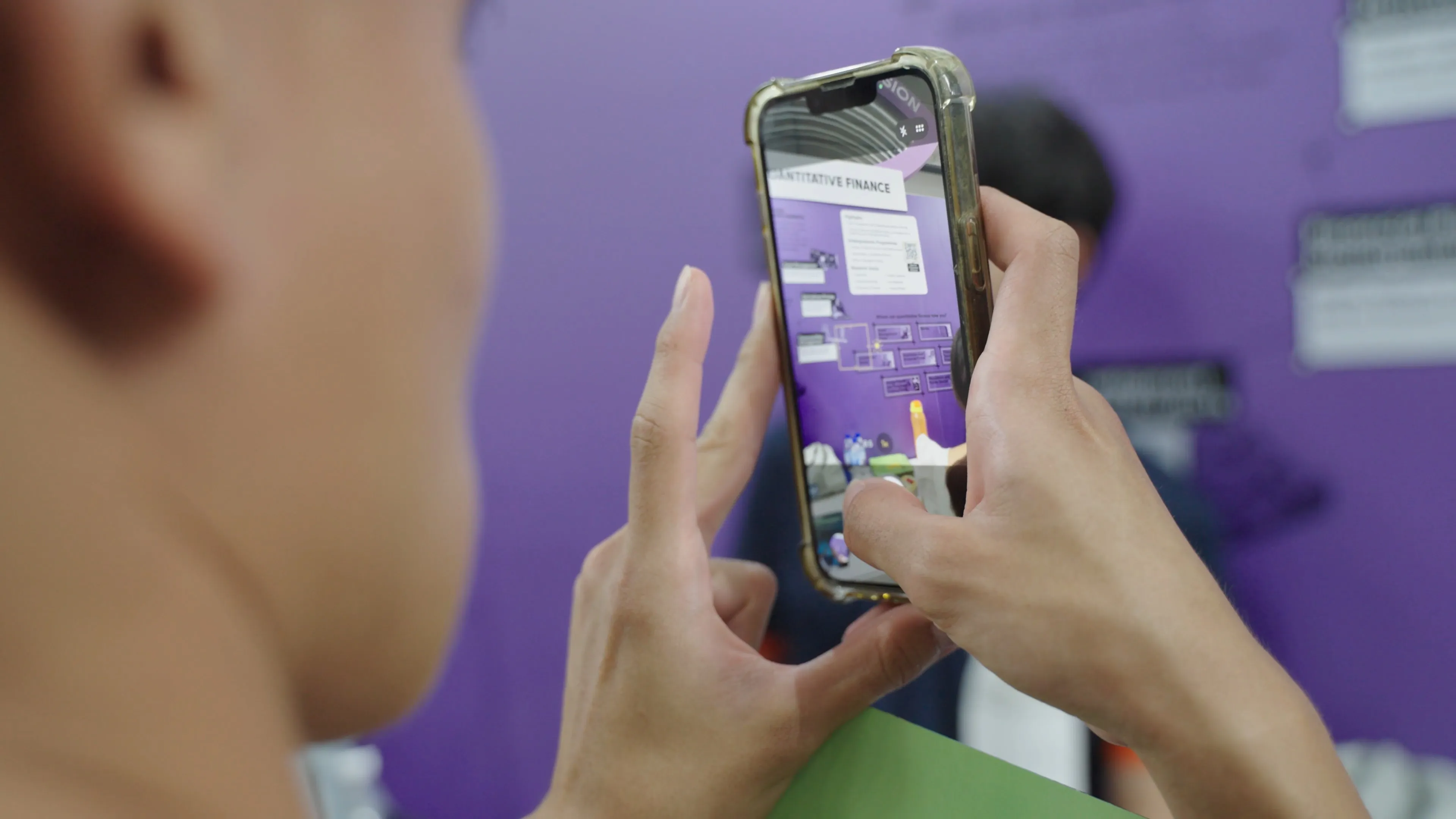
Programme Info
Fabrication with exhibits
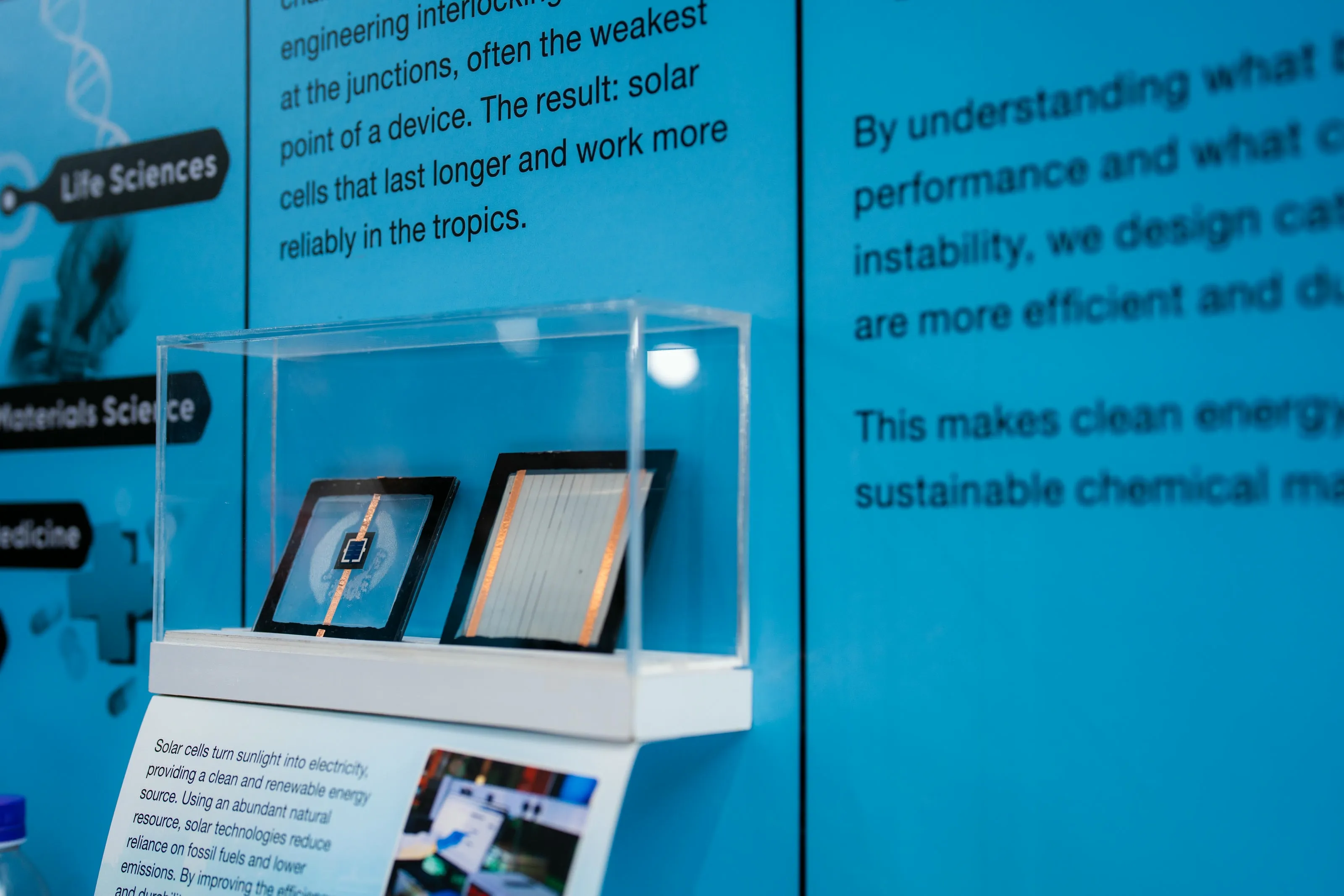
Exhibits with explainer
Identity & Marketing
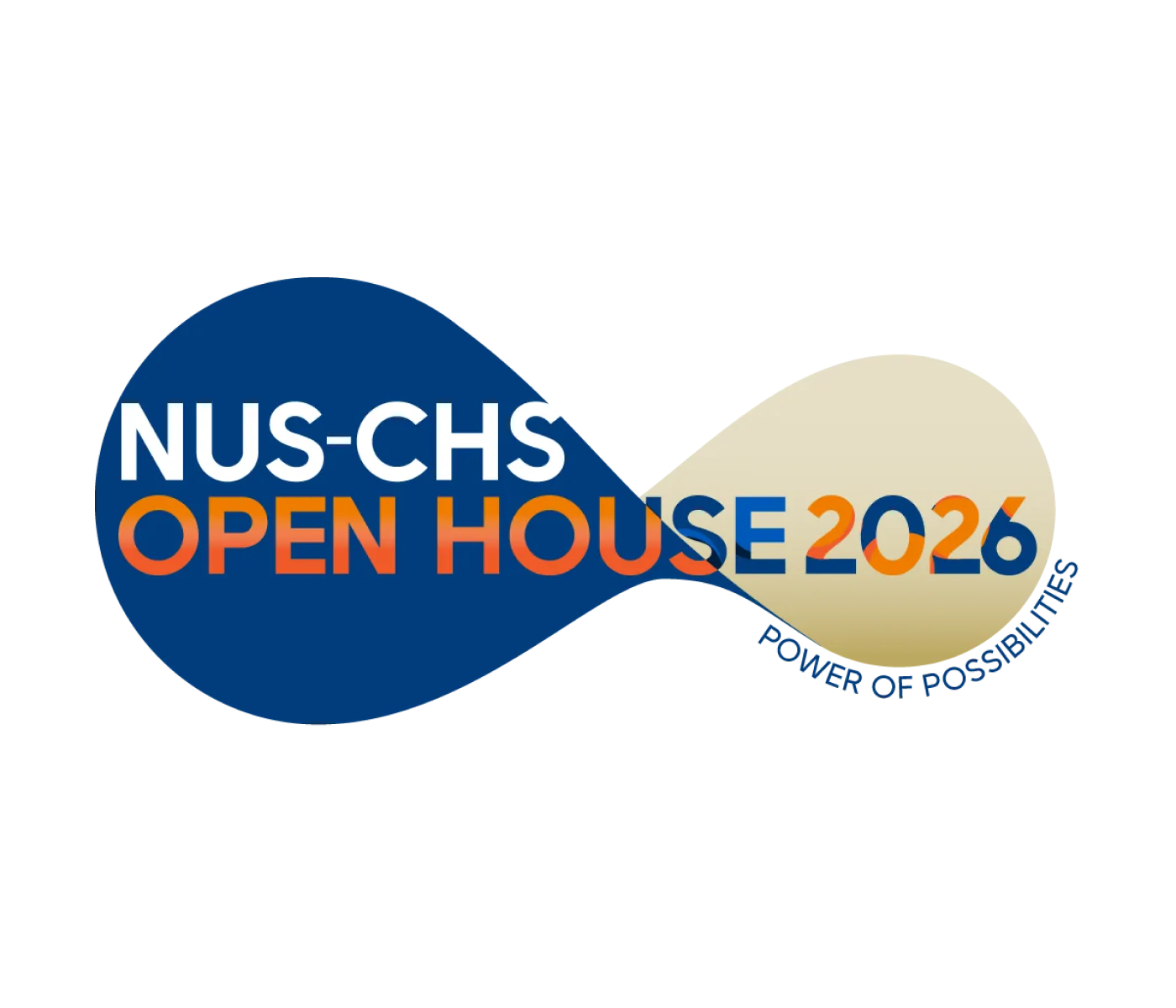
The event identity was created to tie the campaign tagline, "The Power of Possibilities," to the infinite ways a prospective student can explore their options. The event is complemented by a microsite and social campaign.
Campaign branding
Microsite Design (Wordpress)


Social Post
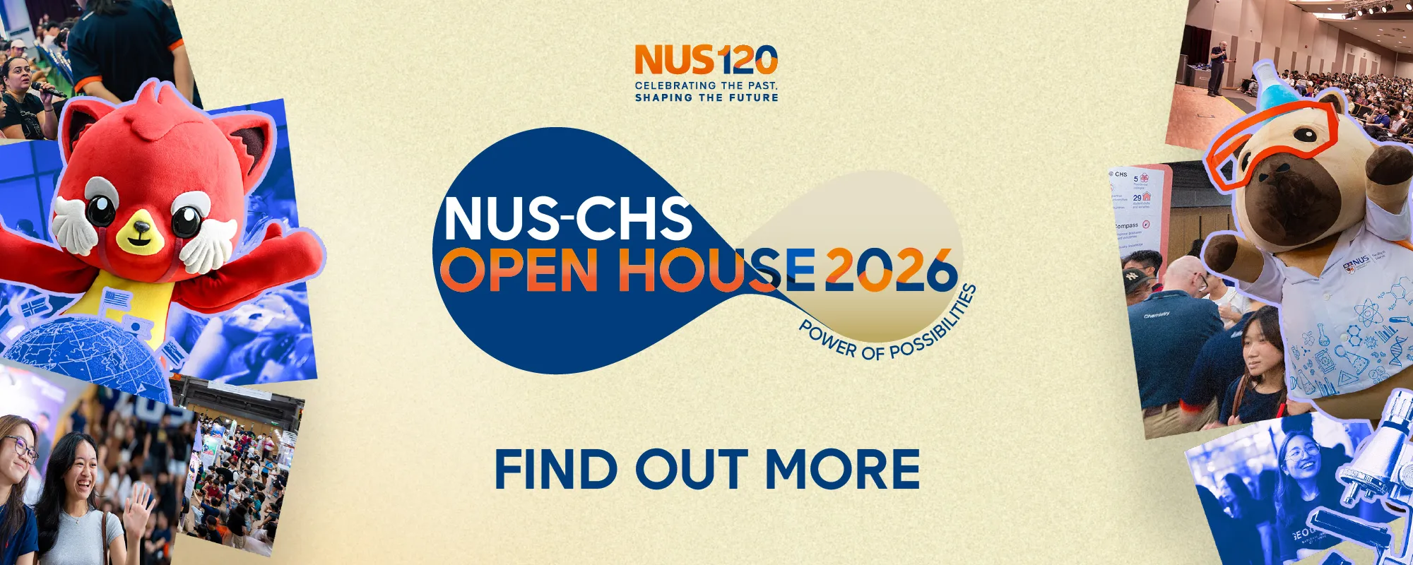
Social Banner