
Ingot PCC
"Redesigning a clinical dashboard to reduce overload and help staff act on patient data faster."
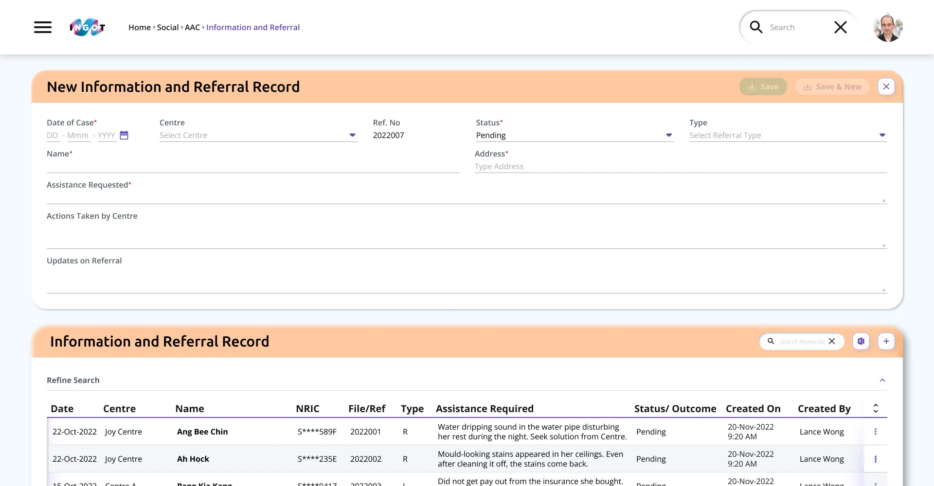
Ingot PCC shifted from person-centred care to active ageing to align with new policy direction. The product needed an interface refresh that keeps clinical information readable, reduces visual fatigue and improves confidence during long shifts.
To review the design system and define a redesign approach that reduces clutter, improves consistency and supports new modules (including a mobile counterpart) without disrupting existing user habits.
Client
Pulsesync
Scope
Design System
Visual Design
Prototyping
UX Audit
Date
2021 - 2022
Understanding the objective
The design process focused on building a solid foundation: align with the product, engineering and medical stakeholders to clarify core workflows, then iterated from structure to visual system to support bug fixes, feature upgrades and new modules.
Discovery and key issues
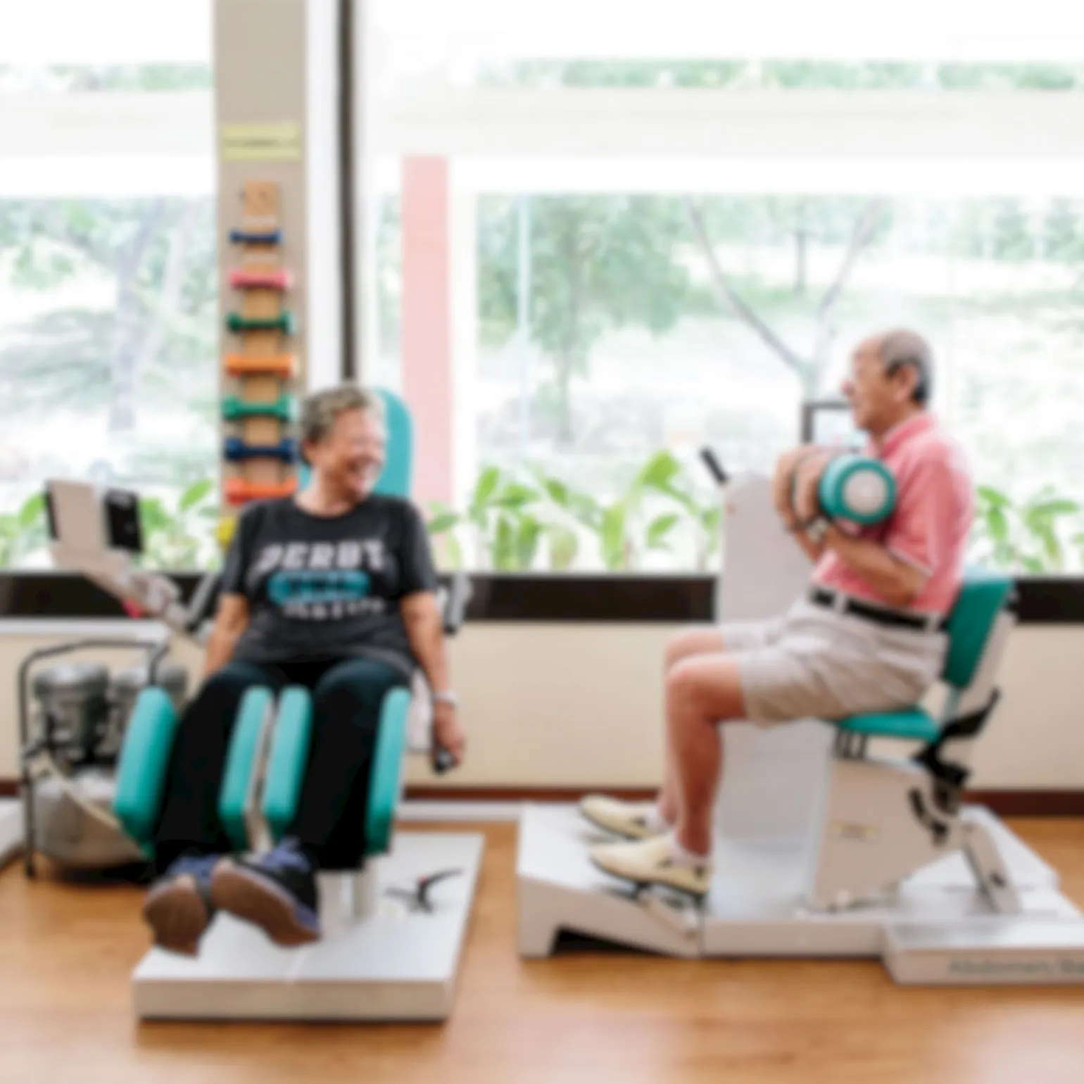
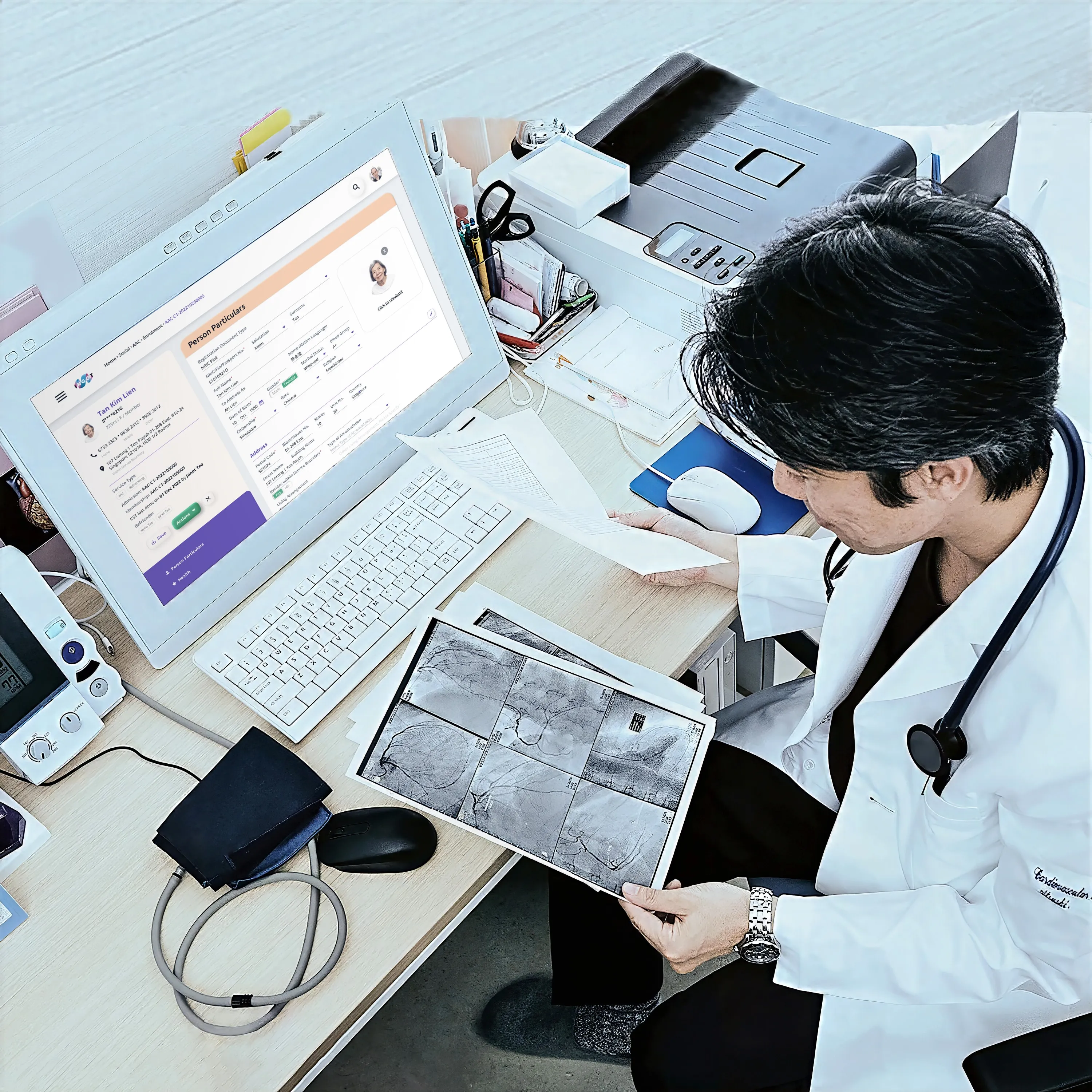
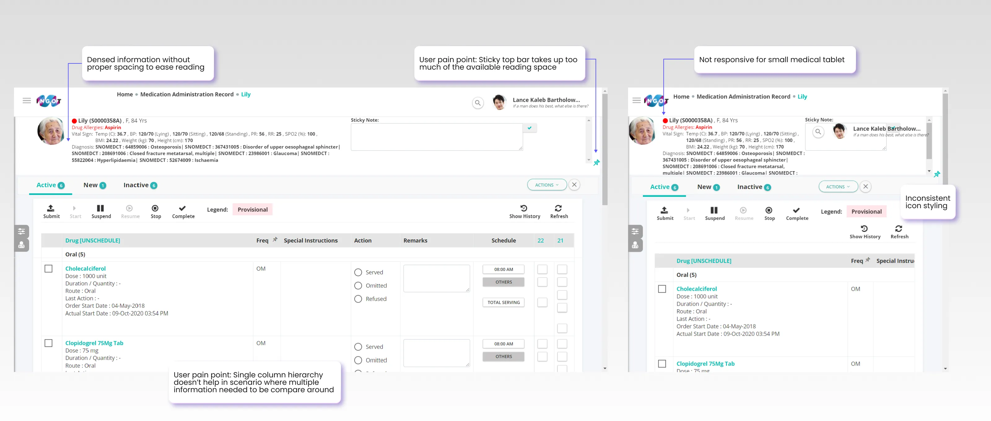
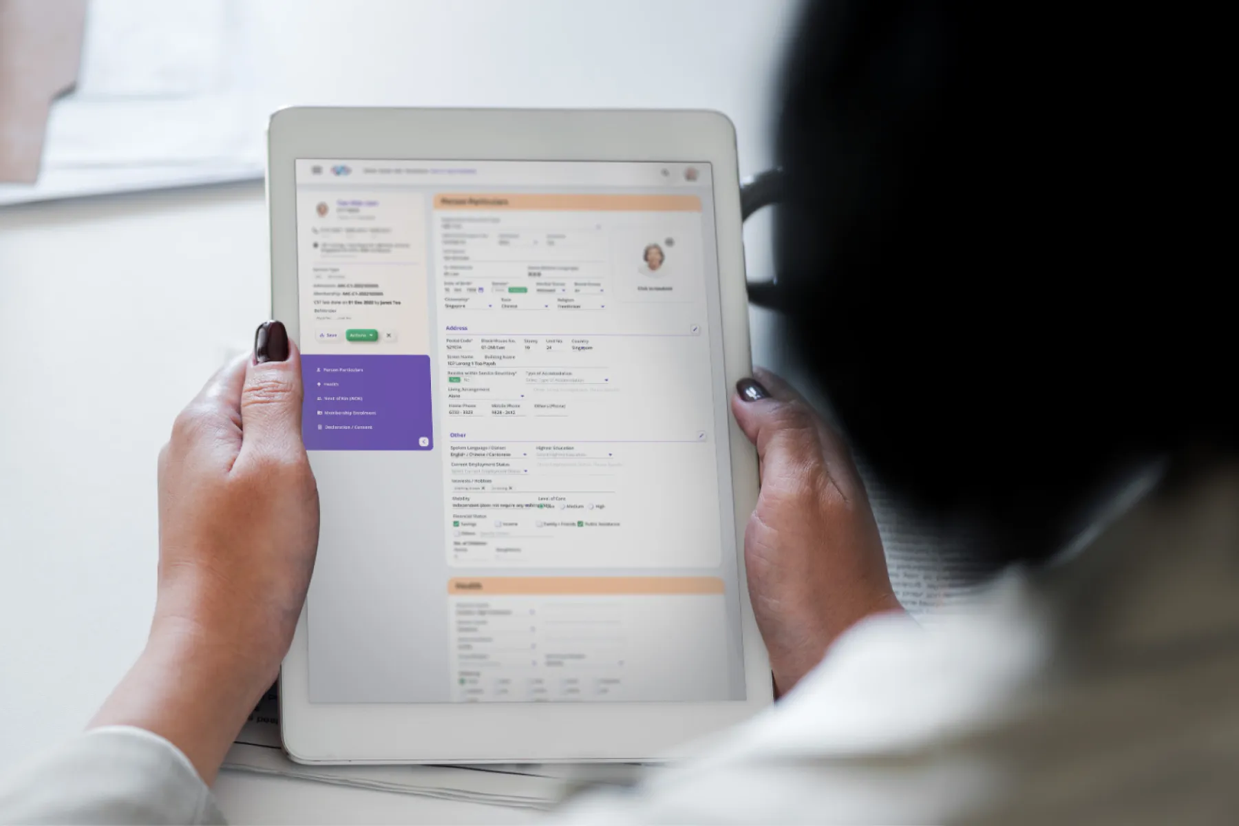
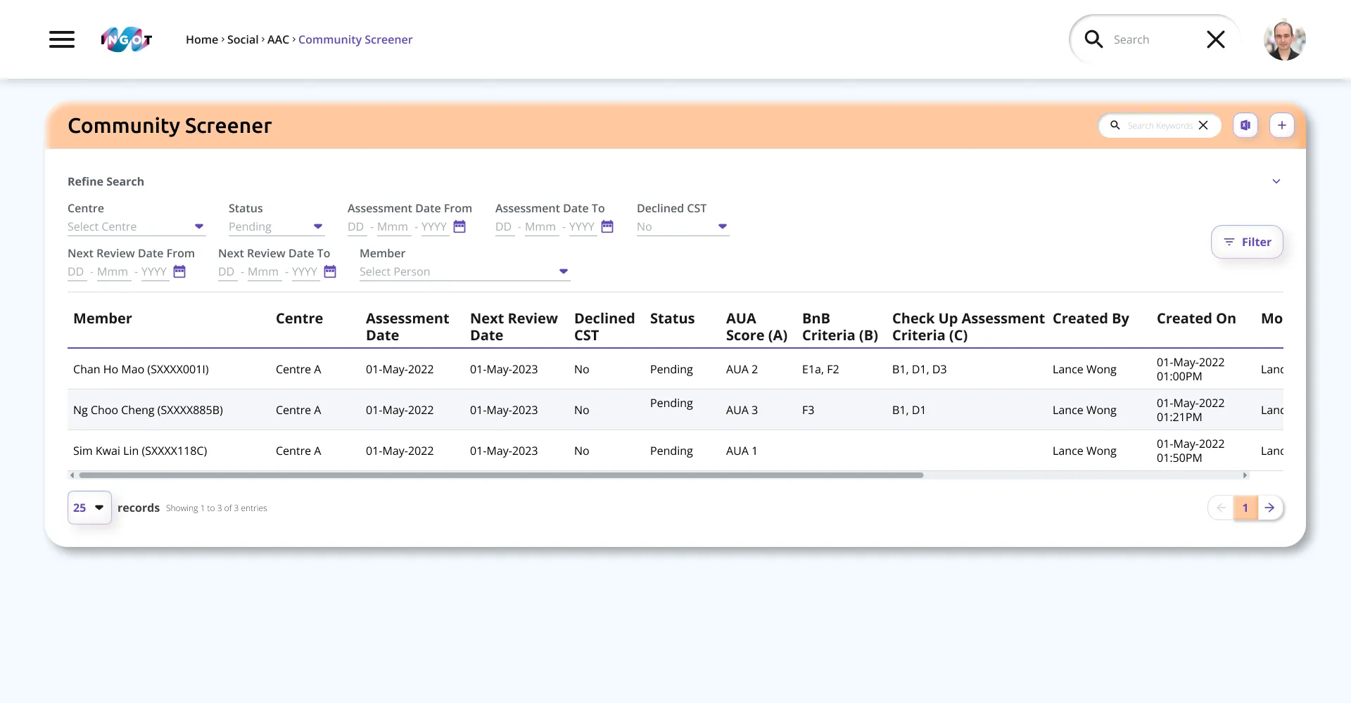
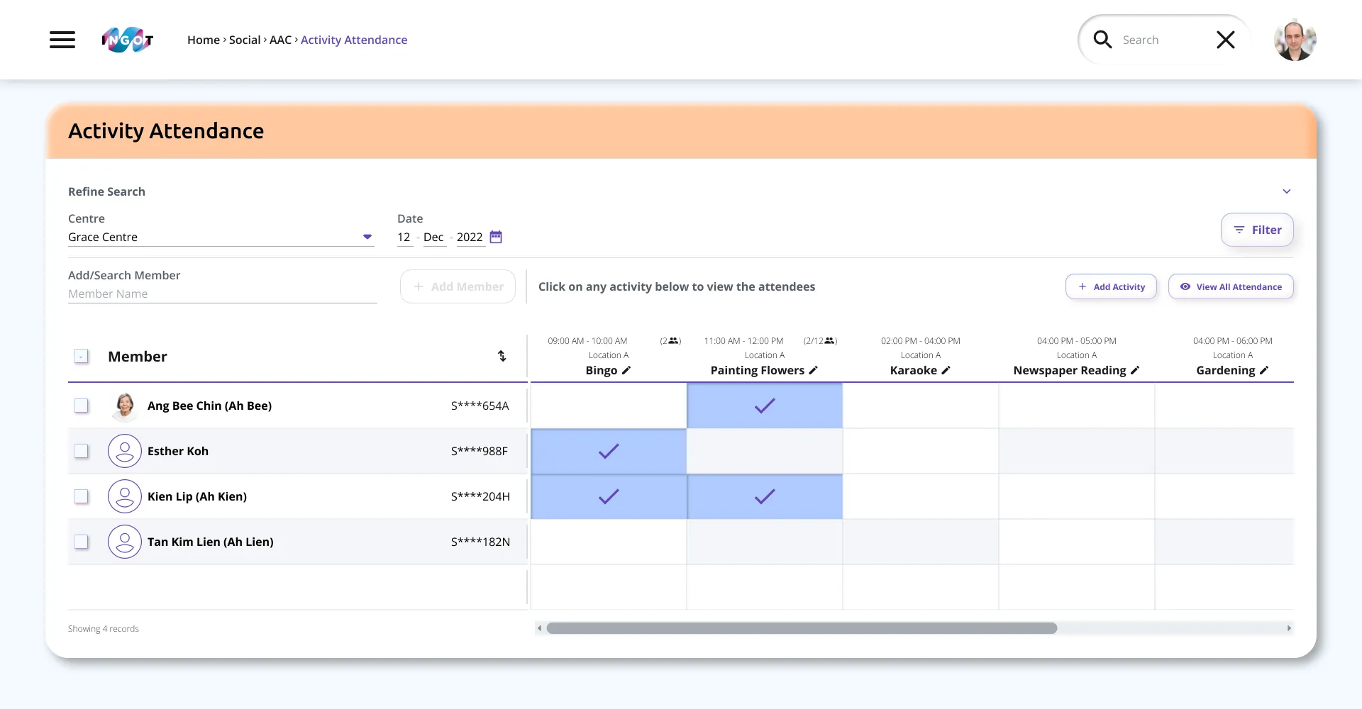
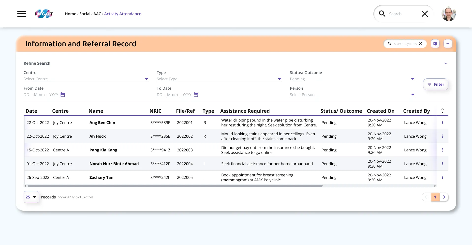
Managing clinical information can be overwhelming for medical staff, who require an efficient way to interpret complex data, necessitating an empathetic design that reduces visual clutter and alleviates stress during long shifts.
Aligned with stakeholders on 3 UX priorities:
Reduce overload
Improve hierarchy so records stay scannable
Unclear and inconsistent icons
Standardise icons and meaning across modules
Refresh visual style to build trust
Make the interface feel more approachable without losing professionalism
UI Audit
Style testing
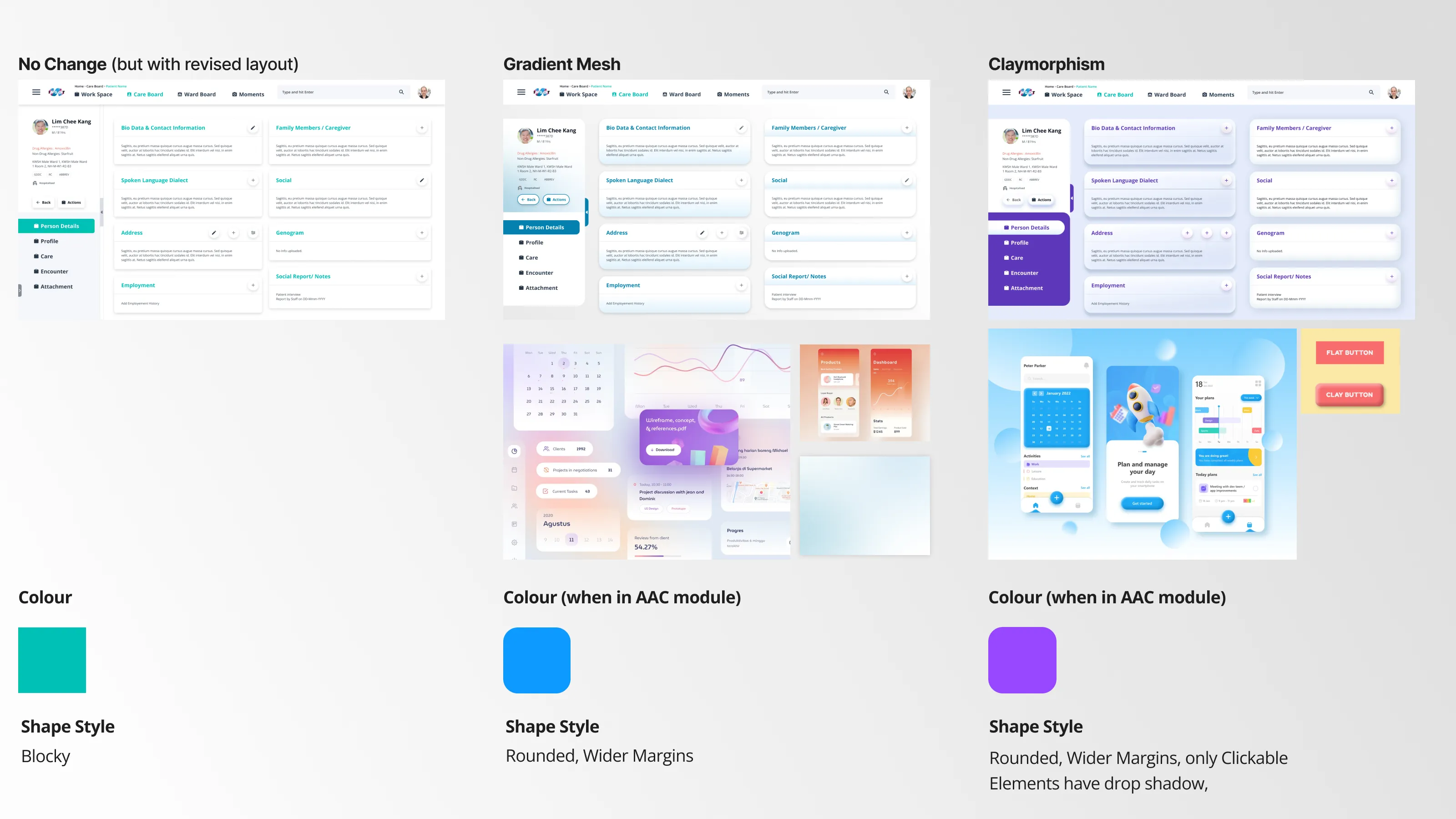
Tested multiple visual directions and selected a friendlier, tactile style that felt familiar enough for existing users, while improving clarity for daily use.
early stage Visual moodboard
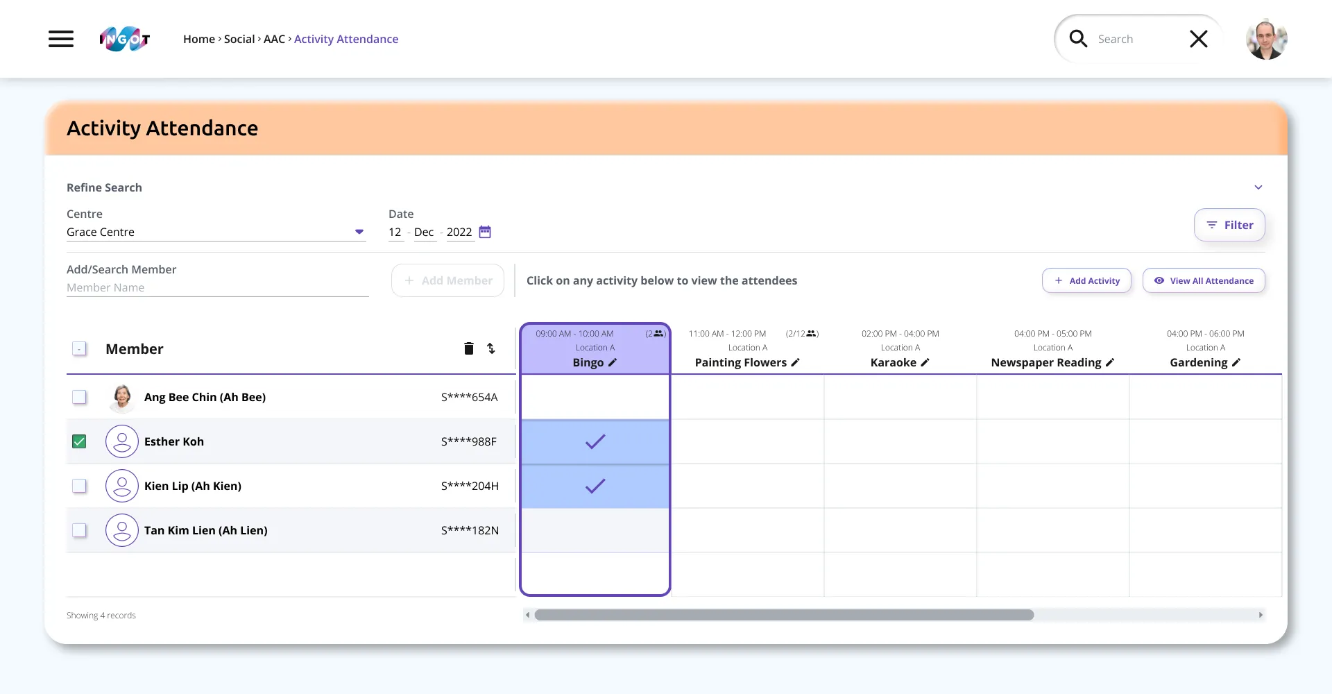
Layout and system improvements
Introduced a more breathable grid and clearer components so information is easier to compare at a glance, while building a more consistent design system across modules.
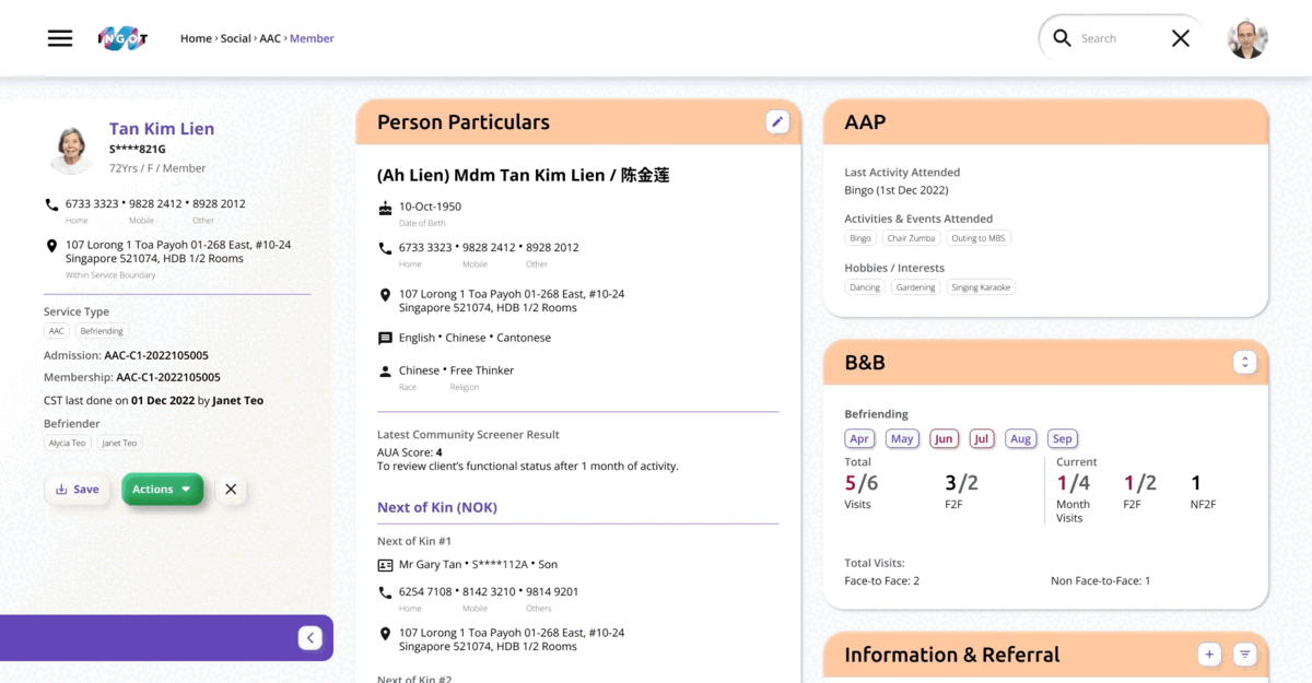
Breathable grid
Mapping user flow
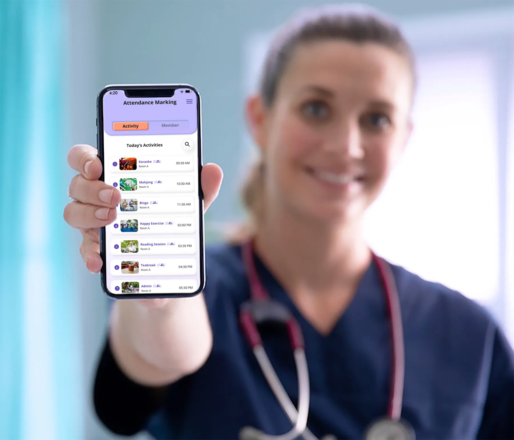
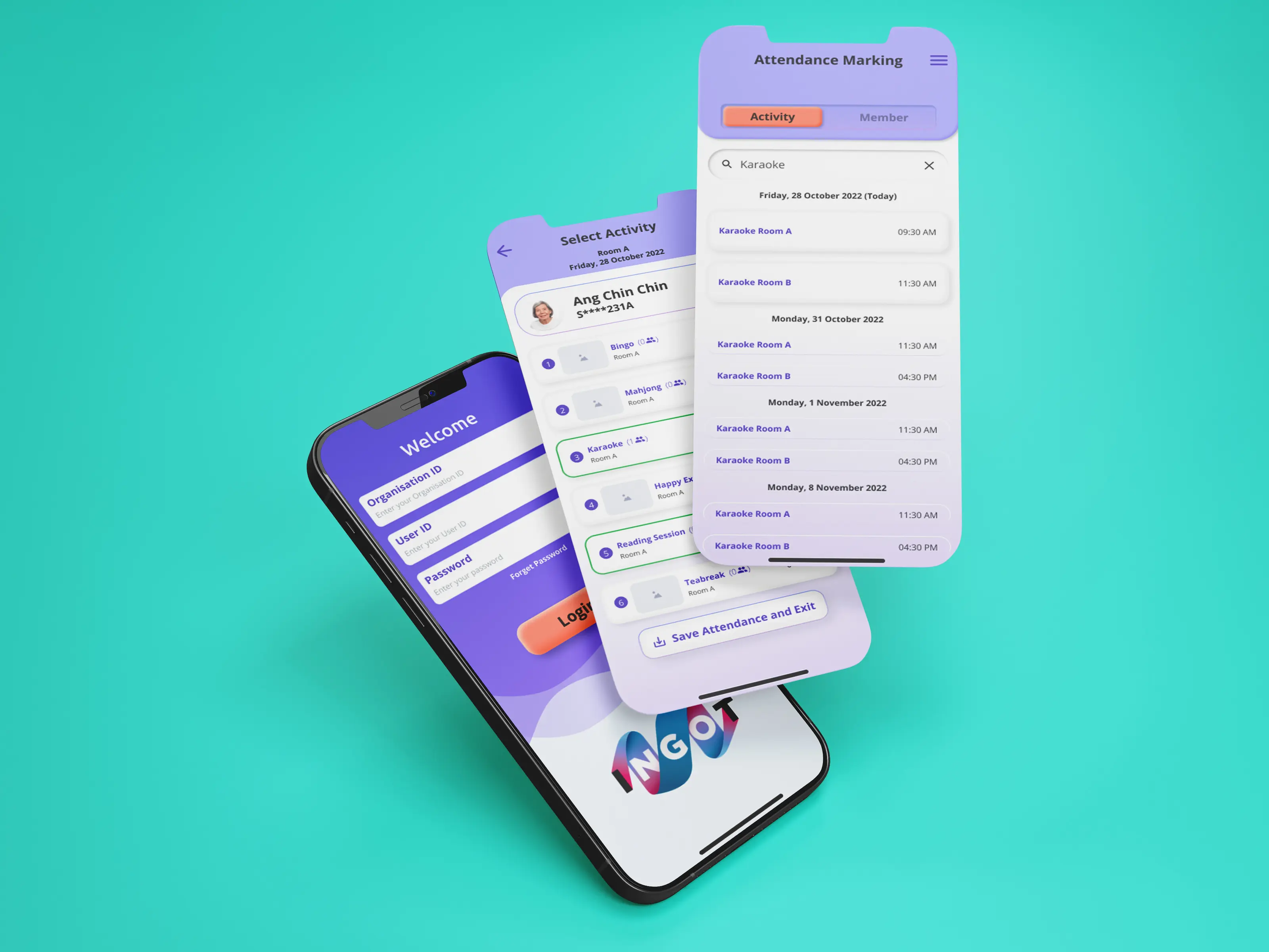
Mapped key user journeys for new module add-ons and the mobile experience, keeping workflows simple and predictable for clinical teams.
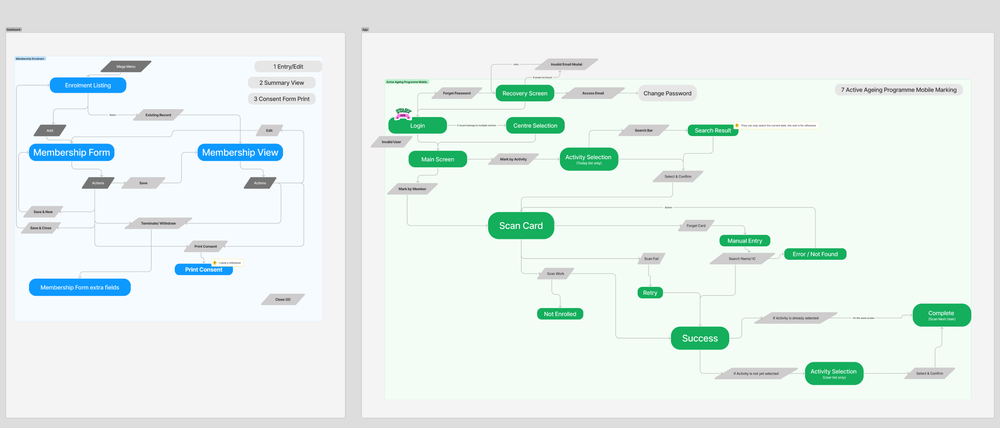
dashboard (left) / Mobile (Right) Flow
Outcome
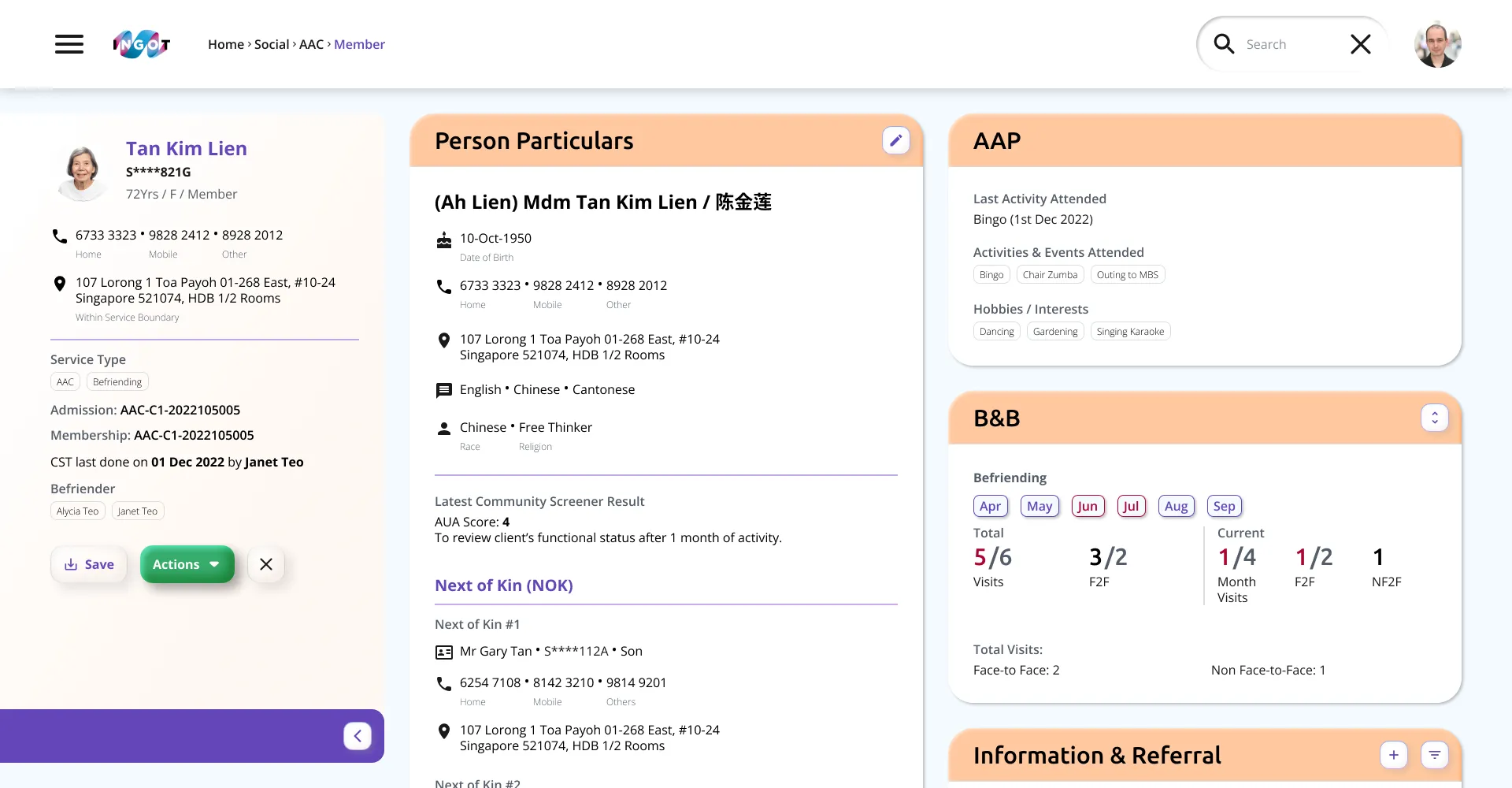
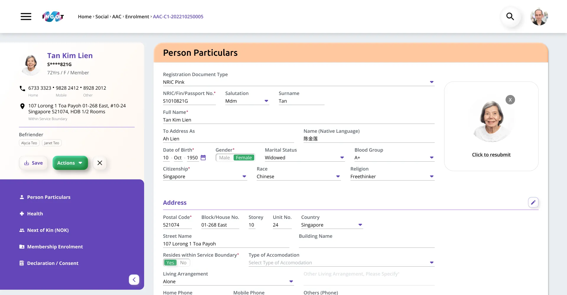
Design system
Created a consistent component and style system to reduce design inconsistency and keep the product cohesive as features expand.
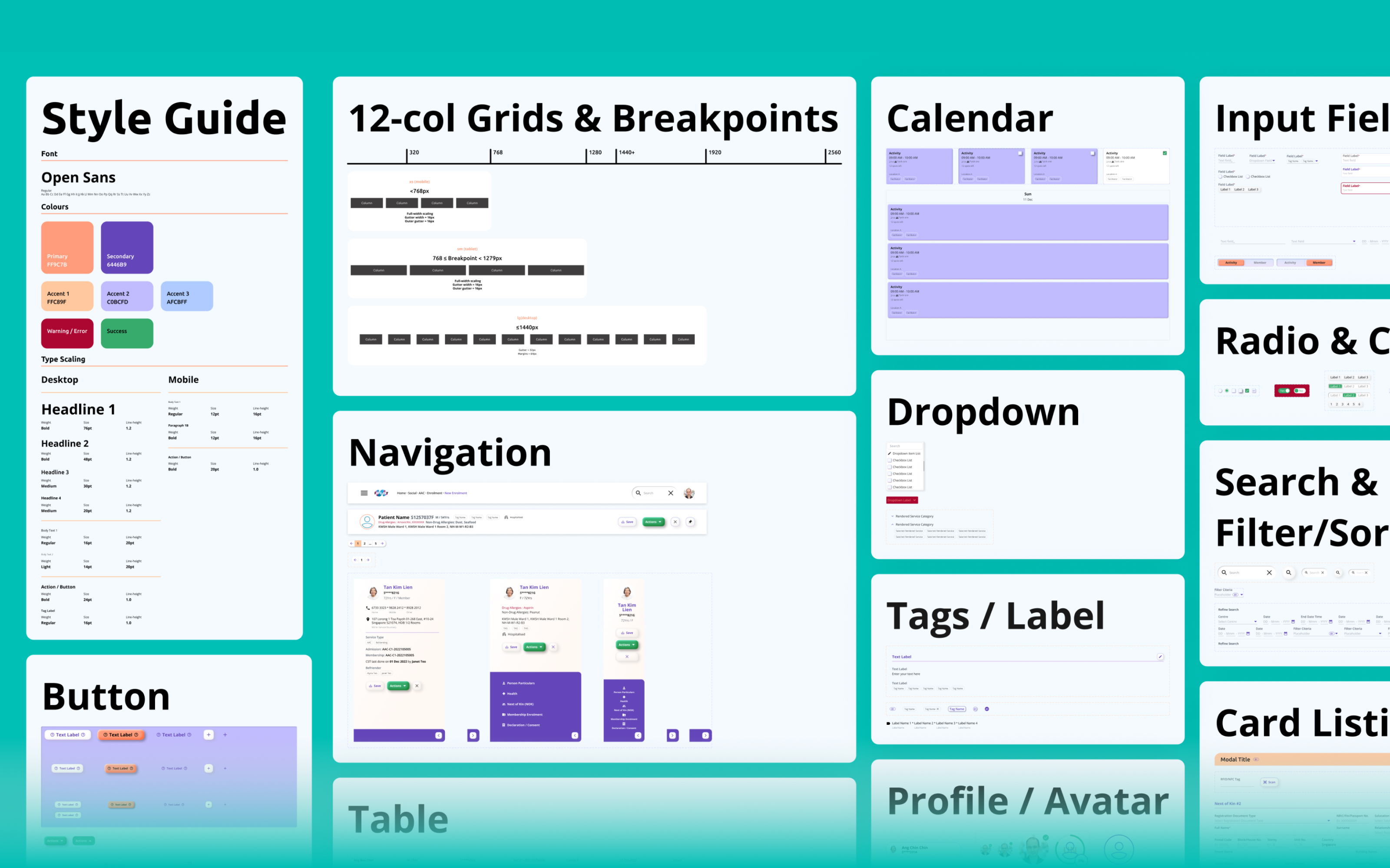
Components
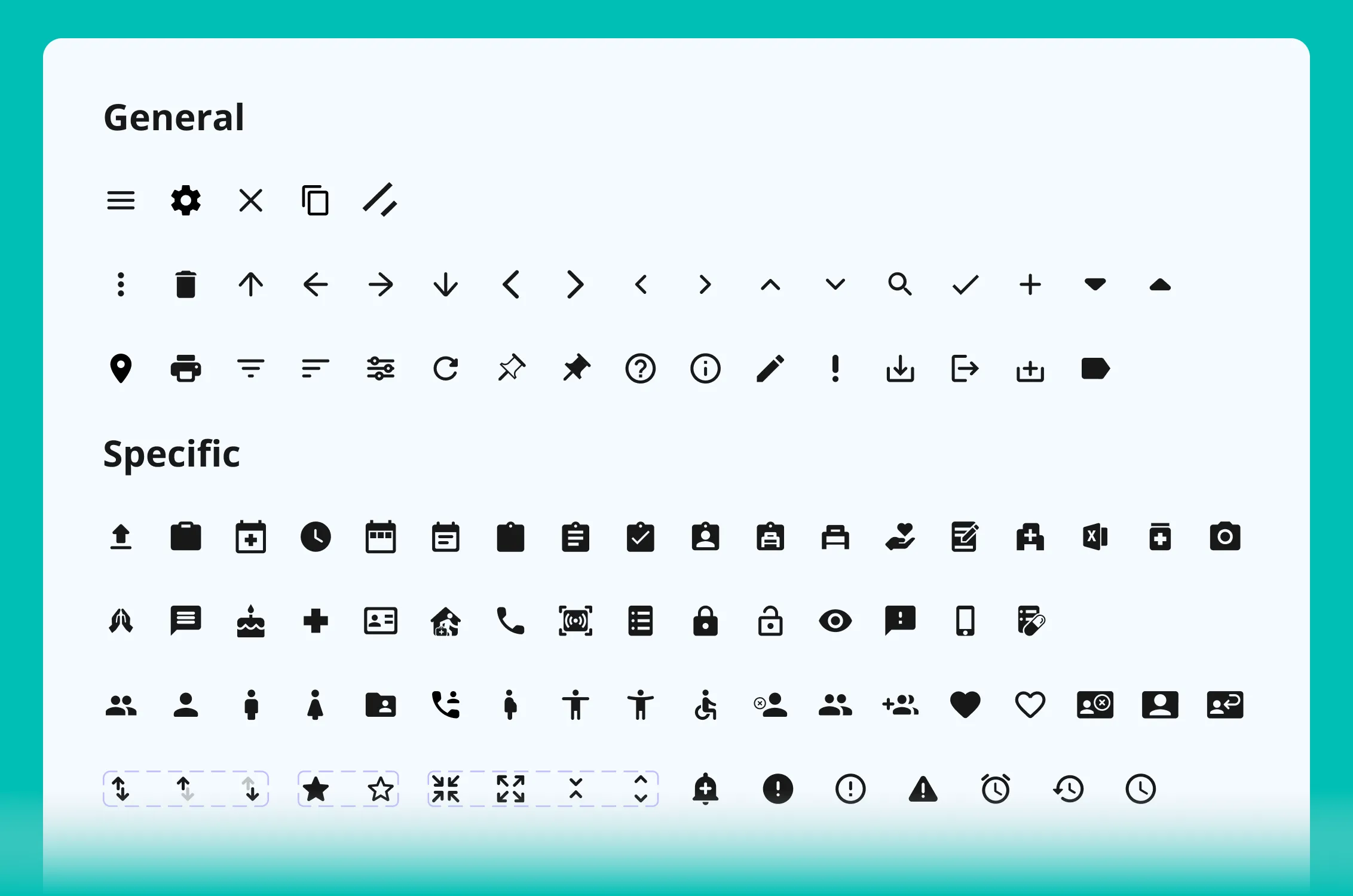
Icon system
Standardised icons with a shared grid and style rules, improving legibility and reducing ambiguity across the interface.
Icon grid
Icon system
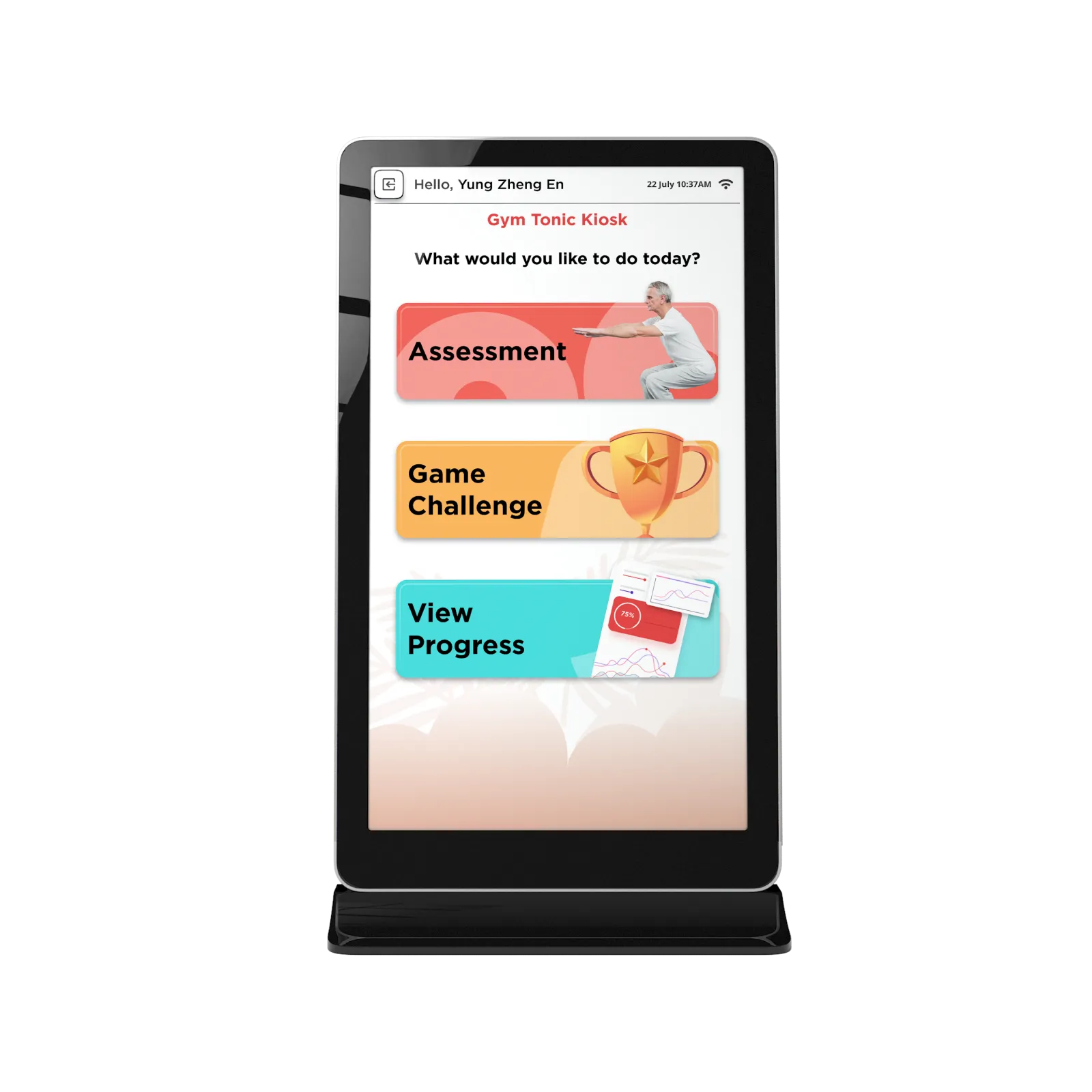
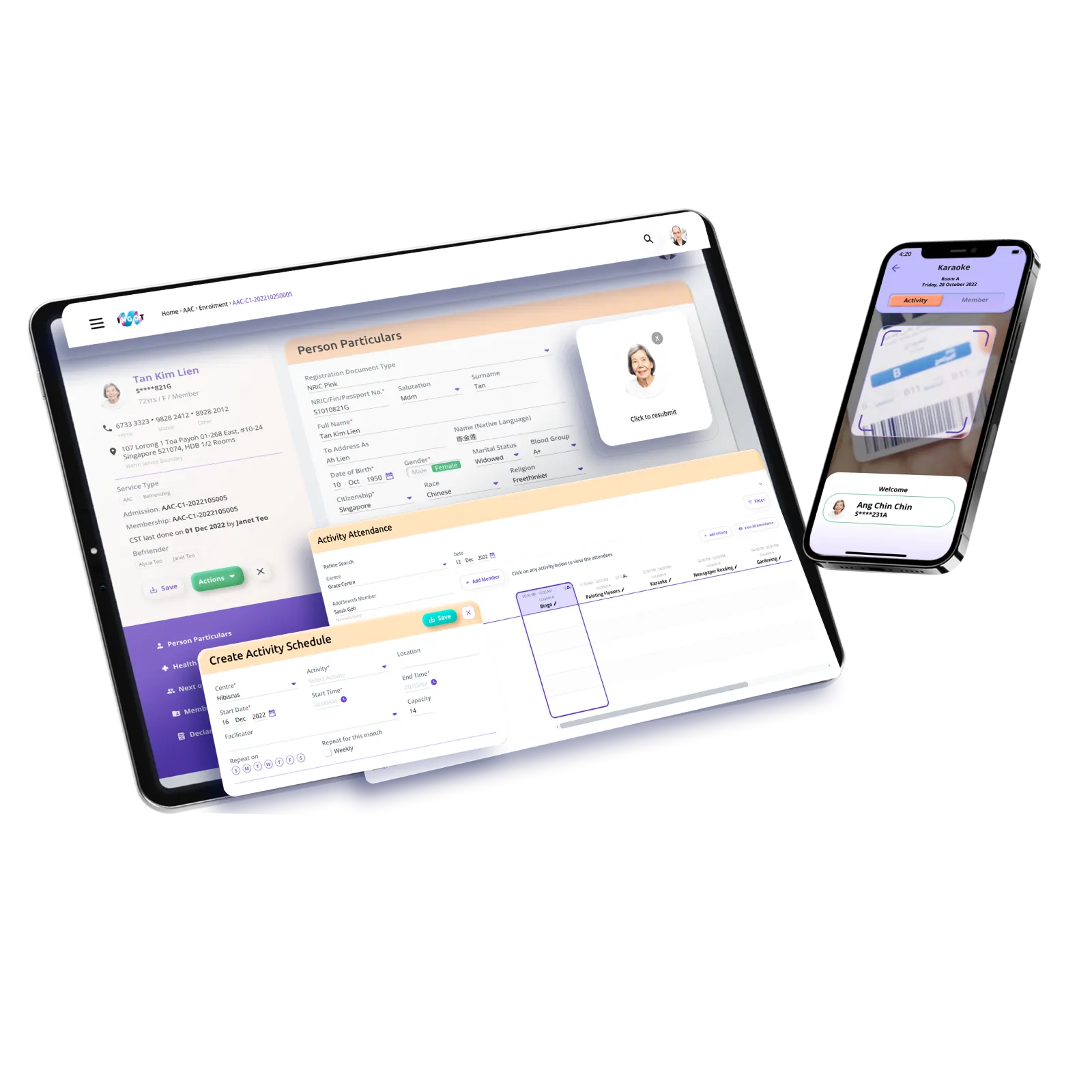
Dashboard Prototype
Remote view
House Visit System